- test :
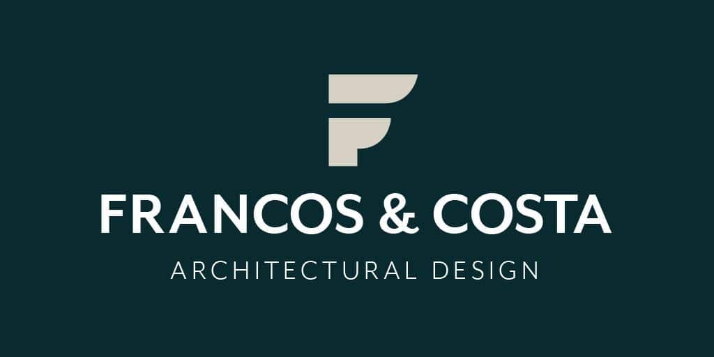
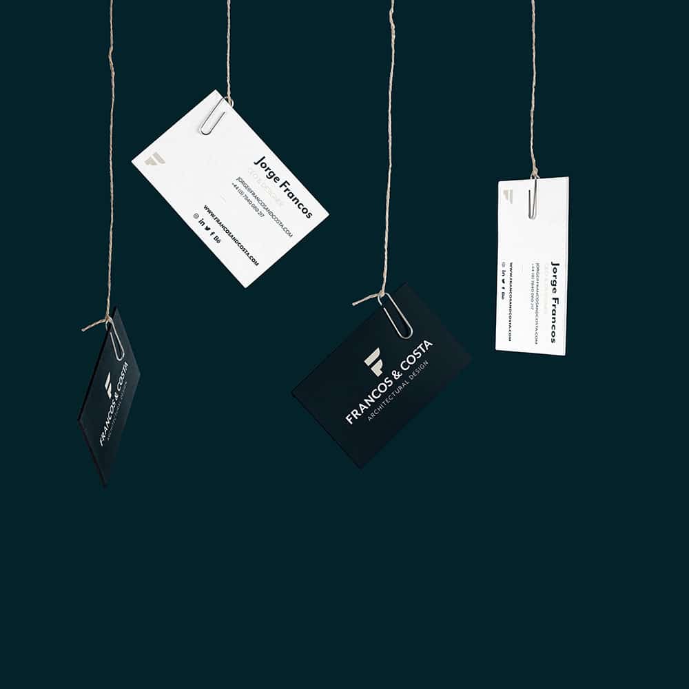
We’d like to introduce our brand, our personal identity. Francos and Costa stands for the values that we believe in; tenacity, decisive determination and positive and innovative attitude where our clients are always a priority. The branding includes our logo, web design, social networks, business cards and stationery aesthetic.
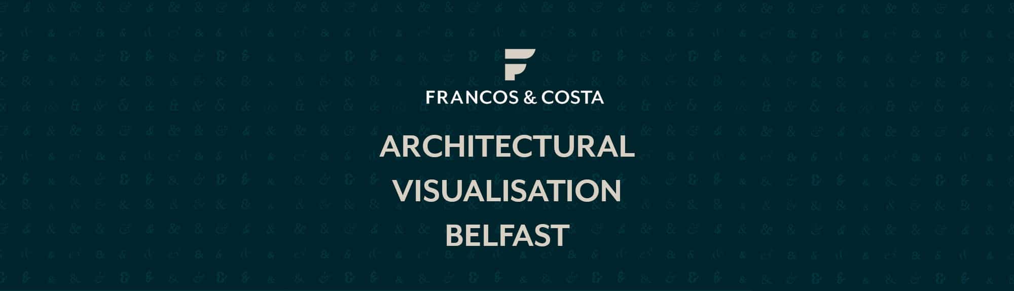
Francos and Costa Architectural Visualisation Identity
This would not be possible without Javier Balvin, a Spanish freelance designer responsible for our brand creation to express our way of thinking and working.
We have interviewed him to get to know more about Francos and Costa and its brand identity.
Can you tell us about you, your experience and what you are working on at the moment?
Well, let me introduce myself, my name is Javier Balvin Lau. I have a degree in Industrial Design Engineering and Product Development from the School of Engineering and Architecture of the University of Zaragoza and I work as a Zaragoza Designer. I am currently working as an advertising creative in an advertising agency in Zaragoza (Spain). I work for national clients, creating communication strategies and marketing campaigns.
What or who has been the most important influence for your work as a designer?
If I had to think of the greatest reference I have … I would tell you that it is José María Cruz Novillo. He is the best designer in the last 50 years in Spain not only for me but also for many people. Cruz Novillo has created emblematic identities as Renfe, Repsol, El Mundo, COPE, or the PSOE fist and rose.

Cruz Novillo has made identities that have remained intact despite the ephemeral changes and trends in the graphic design world and especially branding.
How would you describe your style?
I would say that my design style is a functional style. I try to get away from the art world even though many of the creations I made have a great creative load. I always try to design with a purpose, knowing who I’m designing for and what I want to express with my graphic skills. This not only from the graphic or composition point of view but also from the digital design of websites or apps.
What aspects of your work are the ones that you are most passionate about?
I think it is to arrange the elements in one piece. As I come from an engineering background, I like everything to have a logical meaning and order. I like to outline, prioritize headlines, investigate the reading flow that users will have. I would say that my passion is the reason for a good design.
What is the secret of good branding and what is the impact of it?
Branding is not just visual identity (logos, colours, aesthetics, etc.). It is a discipline that is dedicated to the creation and management of the identity of a brand, its personality, its values, its SEO, and even the mood to communicate with its potential audience.
Thanks to all those reasons a brand can make the difference from its competitors and obtain the greatest effect, connecting with the public.
Before starting to develop a concept, what do you ask the client?
Before starting a project with a client, it is important to begin with a counter briefing, where you express all the doubts you have or that a future buyer could have. There are a number of questions that are unavoidable to ask the client before coming up with any creative concept.
- Why do we want to start a communication campaign?
- What do we want to achieve?
- Who are we talking to?
- How is your clients’ relationship with your products or services?
- How do we want to be seen?
- Why will they trust us?
- How do we want to express it?
- And one of the most important for the proper functioning of the project …
- What is the budget available for the creation of the concept of this campaign/action?
What was the process of creating the Francos & Costa identity?
Jorge Francos contacted us through our website javierbalvin.com and told us about his business future plans in the world of visualisation architecture in Belfast city and the possibility of expanding in the future with headquarters in Spain.
Jorge came with a very powerful initial concept. He told us about his great grandfather, the story of a man who had to emigrate to Cuba to find new job opportunities. An entrepreneur with effort and work values that stood out. The story of that working man moved us and was the key to the start of the creation of Francos & Costa
Tell us about the most challenging issues to develop our identity
The main challenge developing the identity of Francos & Costa was the name itself. An extensive analysis of their competitors was made in Belfast and we found out that almost everyone used keywords from their sector for their brand name. In our case, we did not want to lose that heritage of going beyond yourself. On the other hand, it was going to be a bit detrimental in the digital field for the SEO, but that was something that could be fixed later working on the network.
The choice was made by the core values of their naming which were firmly attached to an identity history which couldn’t be achieved otherwise.
What are your favourite features of this identity?
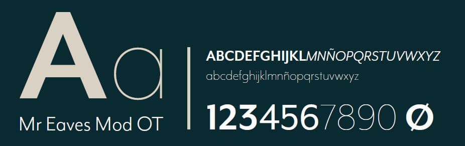
I like the fact that it is a versatile identity. When I say versatile, I mean in two aspects. The first one is its graphic perspective since it combines modern lines with the typography Mr Eaves (A rotund and human typography) in contrast to a traditional and sober green colour. And secondly, in the digital perspective, since it is a modern future-proof brand. Its identity consists of a powerful isotype, which can be adapted to any size and media and can be used without the need of any other element.
What is the main reason for the green colour?
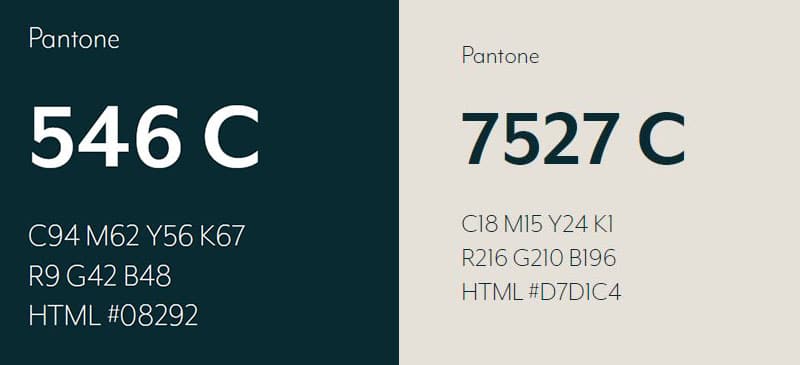
While we were analysing the competitors in the architectural and 3D visualization area in Belfast we noticed that this was going to be a derby and that we were going to have to work hard around the brand and its communication to be better than our “rivals”.
One of the ideas that we came up with, in one of our meetings, was the British racing green. If you are wondering, where have I seen those colours? In lotus? Jaguar? Aston Martin? The truth is that these are just some examples of its popularity as it is an emblem of British industry. Our green, therefore, had to denote competition, elegance … A colour that meets the finest appearance.
Everything on the green !
Having said that, we feel very proud of the final outcome and how our brand defines ourselves as an architectural visualisation agency. We wanted to share with you the whole process carried out in the development of our brand and highlight the great work that Javier Balvin has done during the creation of our identity.
Thank you very much for reading, we hope you found it interesting and you can now have a better understanding of all the work behind an image, see you in the next one!